
 Today, I am proud to present my very own trademark to brand my creations: the corporate logo for Opus Relinque, which will soon be gracing the website’s header and intercommunication.
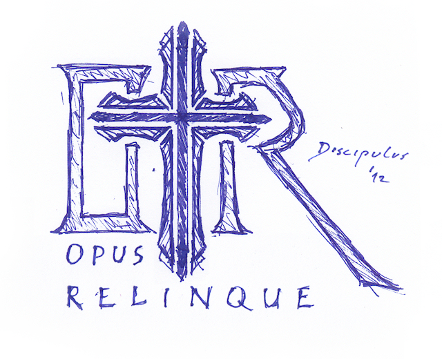
Originating from a simple, but dextrous sketch, the logo shows a graphicalized depiction of the Opus Cross that symbolizes its three-dimensional structure in a multi-part shape, flanked by a stylized render of the website initials, which are deconstructed into sets of cerulean pillars, forming a recognizable as well as discernible emblem that represents my works and aspirations.
This is very nice. I like it
It looks just stunning!
I love how it reflects the different aspects of the website.
After 20 months of blogging it was due time, I created a Logo for myself.