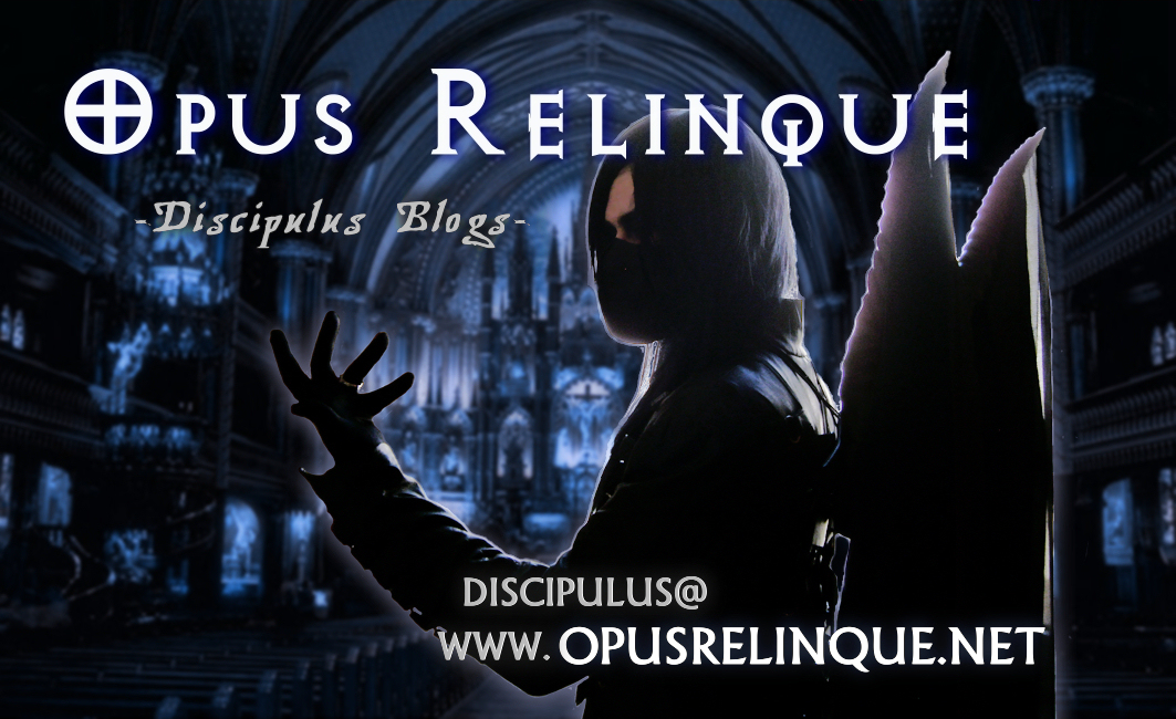
In starting the official marketing of this blog, I wanted to design myself a captivating calling card introducing the site to those who show an interest in the works they see at soirées or events, and through it may not be the greatest artwork on its own, I like this simple mockup for the distinctly recognisable impression it brings.


looks nice, but i would have done the wings shade diferently, right now you see the edges a lot …
yuy being a graphic designer…
XxX Orphea
Yeah, it was all done a bit rushed to get it to the printers’ in time.
The original picture was backlit and gave a terrible reflection on the wings and hair. Making the leathers look realistic on the background was easy, but to get the wings right would probably have taken me a day..
–> not a graphic designer ^_^;
if you want i can do a litle edit, add me on facebook (cathy janssens) or myspace (orphea333) or vampirefreaks (orphea) or really if you need me, my msn (on demand)
nah, that won’t be necessary.
It’ll be a while before I need to print out the next batch
but if you just want another edit to be here, so it looks better…
i have time to waste on that kind of stuff anyway XD